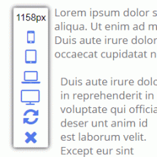
Responsive web design is extremely important for websites, but it can be challenging trying to design content for phones and tablets when you are editing on a larger screen. We're happy to announce that you can now easily visualize how your site will look on phones, tablets, laptops, and monitors with the new toolbar shown here. You can find it in the side menu while in editMode. And although it has choices for preset devices, you can also drag the corner of the screen to view precise sizes other than the presets.


